“Bonobo’s Fragments album art is designed to overwhelm”
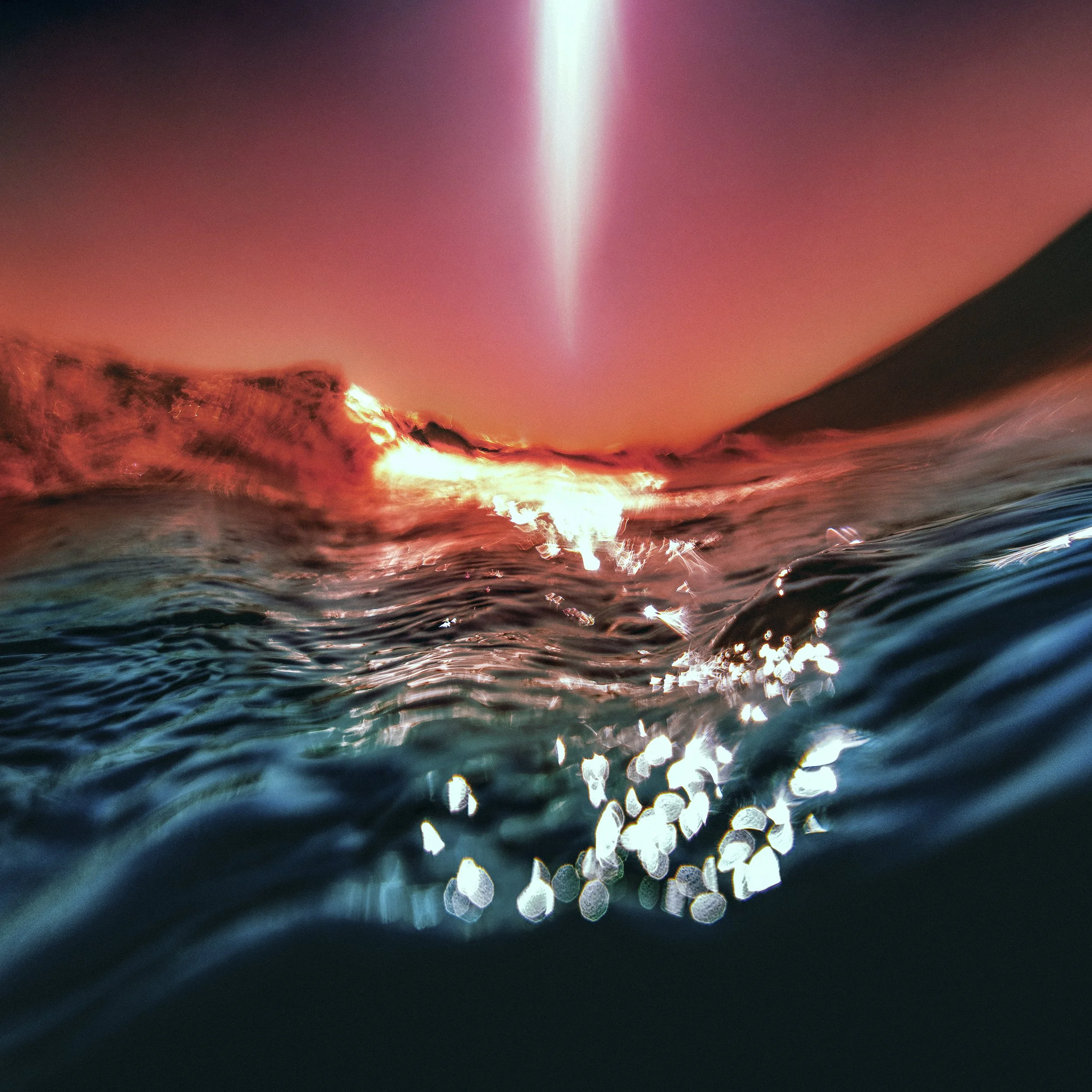
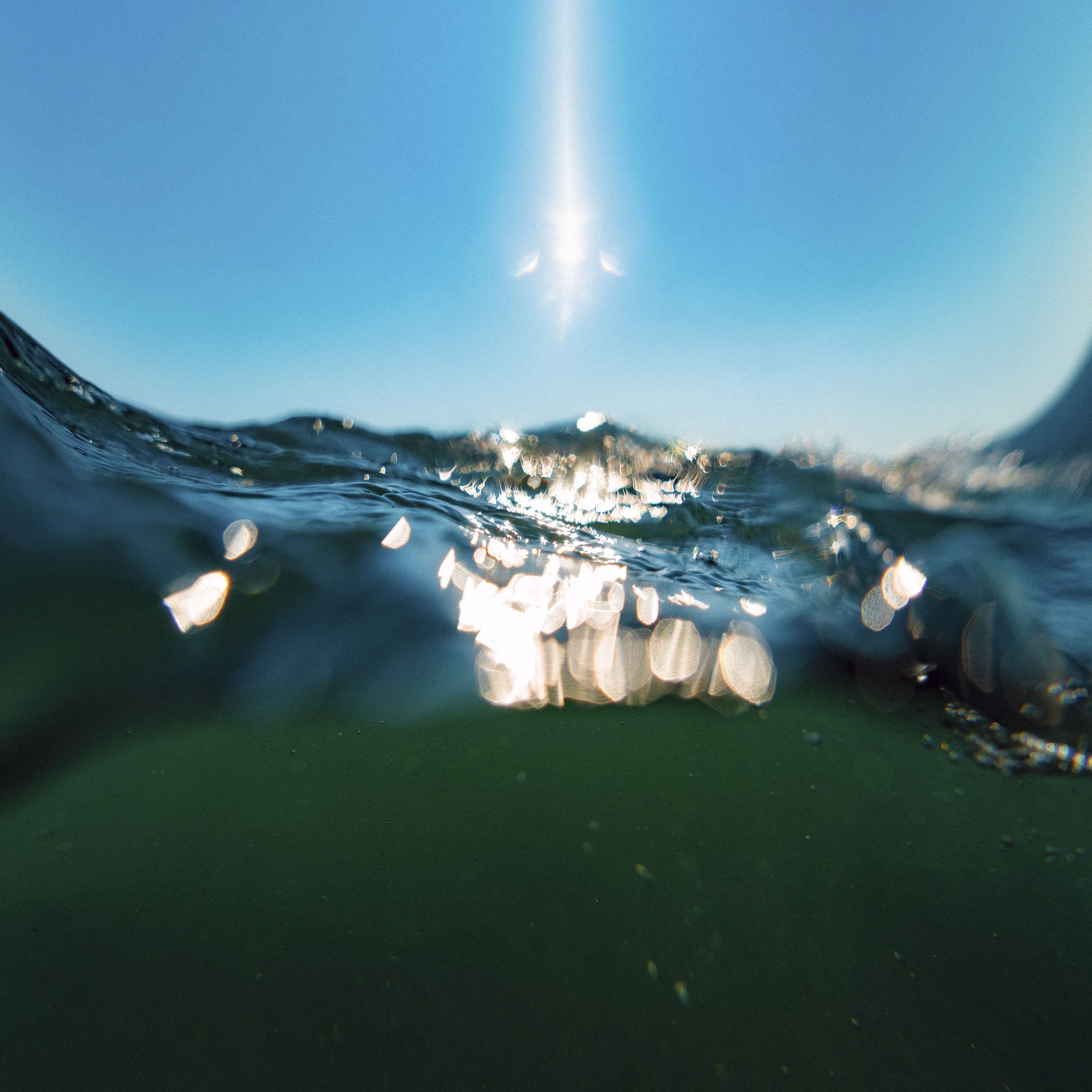
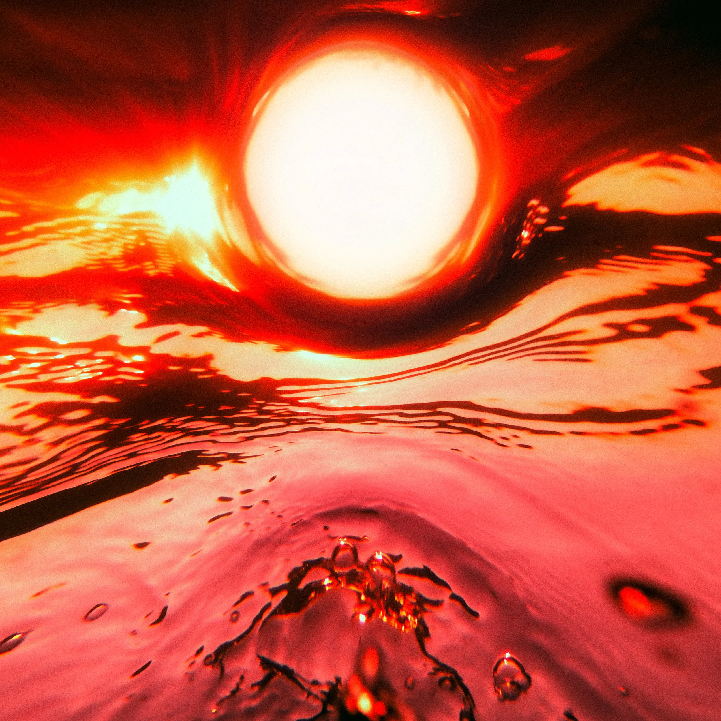
The album might have been born in relative stillness, but the sounds and accompanying artworks – photographed by Neil Krug, who worked on Migration – speak to the collective turbulence of the times in which it was written. “If there is any theme or overall feeling to the record it’s transience. The temporary nature of everything. Tides and cycles were a recurring idea. How nothing stays still for long,” Green explains. “When I talked about this with Neil we wanted to visually represent these themes with movement. Whereas Migration was visually about vast landscapes, Fragments tries to capture motion.”
The pair have by now developed a “shared sensibility”, where “web spinning and throwing out ideas” supersedes a brief and pitch, Krug says. Front of mind for him was divorcing the new work from the Migration campaign, where there was a distance between viewer and the scene. He felt the Fragments artwork “should be completely immersive, it should overtaking, there shouldn’t be any space – not necessarily claustrophobic, but the action and the drama should be happening right next to the camera, so that you can’t get away from it. And I think that excited everyone.” He also wanted to get away from the “elemental” characteristics from last time: “It should be liquid and more fluid and everything should move, and just be a little bit more wild and free.” The answer to that was to “take things underwater”.
Most of the artworks were photographed from water-level, submerging viewers in the thick of the action. In Krug’s hands, the waves become sculptural, and water is manipulated into disorientating angles and dramatic arcs. “That’s always the goal: not that you’re subverting the landscape, but you’re trying to take what’s there and make it your own.”
– Interview by Megan Williams for The Creative Review
Bonobo | “Fragments” Album Campaign
Designed by Mat Maitland and produced by Taylor Vandegrift.
The Making of Bonobo’s Migration Artwork
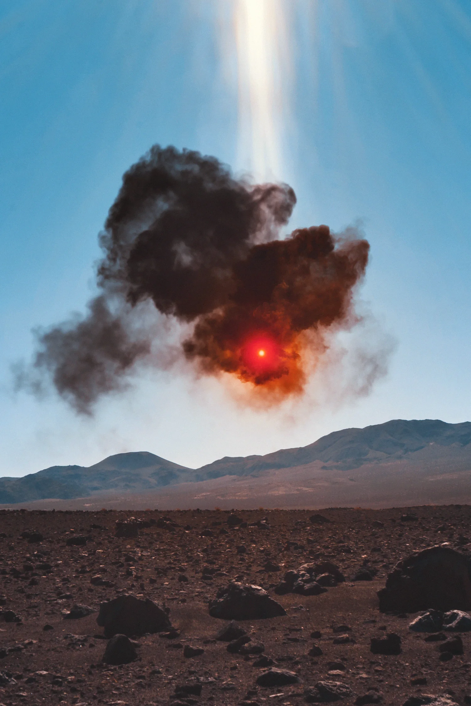
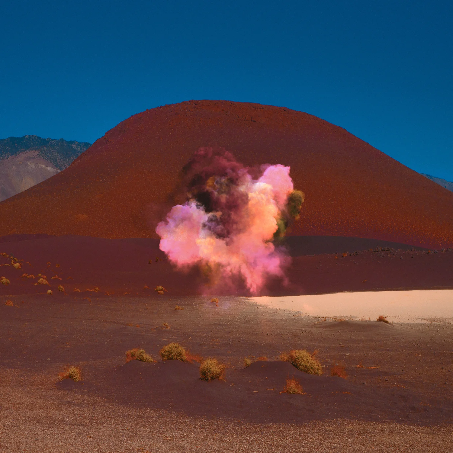
Bonobo released a beautiful video for Break Apart – the second track from his album Migration. Directed by photographer Neil Krug, the film was shot in the Mojave Desert in California but has an otherworldly feel: vivid colour treatments, strange plumes of smoke and glowing lights create an eerie landscape reminiscent of the surface of Mars or some other distant planet.
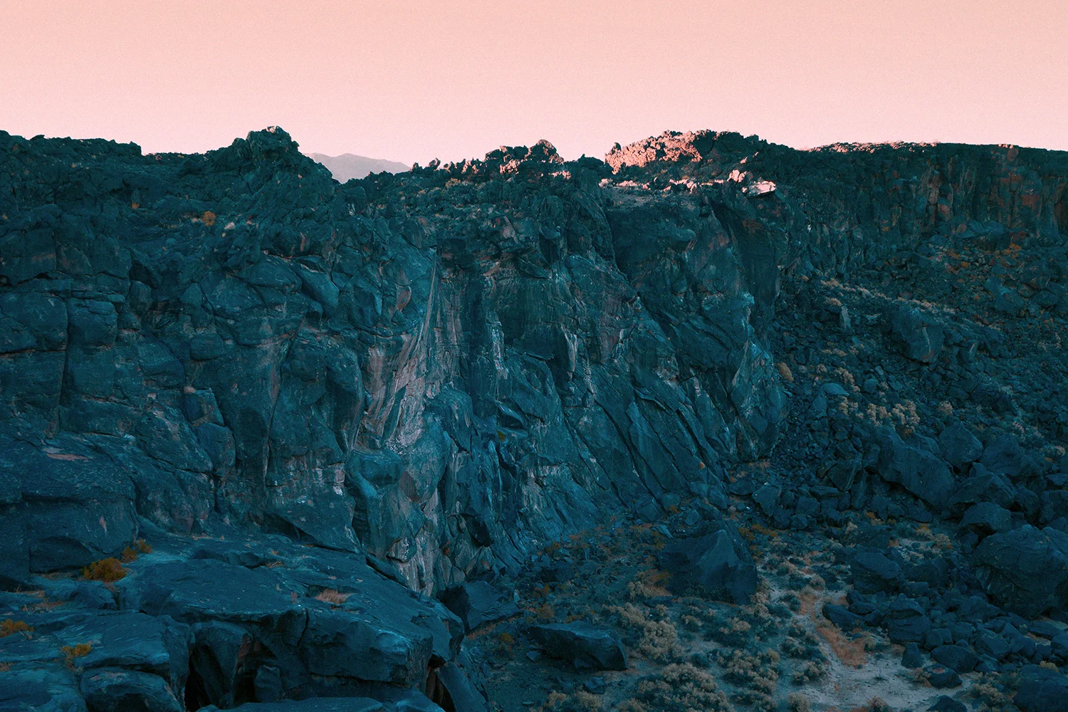
Krug captured footage using a drone while shooting the artwork for Migration. He drove to the desert in the middle of the night to photograph the area just before sunrise, avoiding the sun’s intense heat. “We were shooting in the dead of summer … by high noon it’s around 120 degrees in that part of the Mojave … so we made the executive decision to shoot as much of it, if not all of it, between four and six in the morning,” says Krug. “It was maybe one of the most beautiful shoots I’ve ever done in my career,” he continues. “When we arrived, it was pitch black and so tranquil and when we got to the spot where the cover image was taken, the horizon was like a neon blue. There was this very thin blue line glowing and you could hear birds singing in the distance. It was sort of like a soundtrack.”
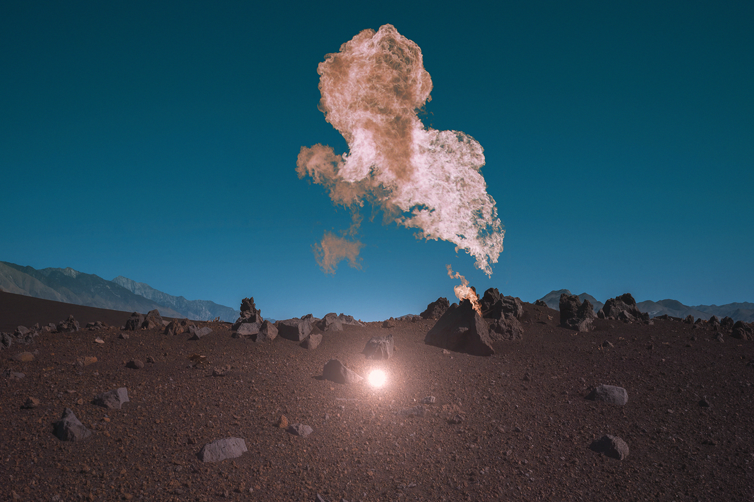
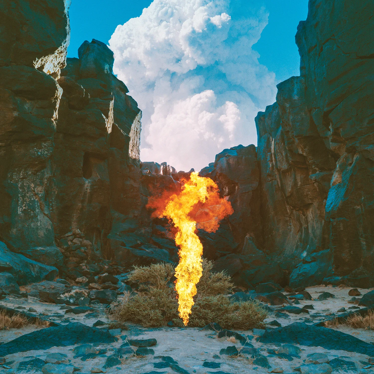
The image on the album’s cover shows a column of fire rising up from the ground beneath a deep blue sky. Other images show dark plumes of smoke hanging in the air and rocks rendered a vivid shade of pink. Krug – who also shot the cover image for The Horrors’ album Skying and Bat for Lashes’ The Bride – says Bonobo wanted the artwork to feel “beautifully sinister”. In an initial meeting, the pair discussed creating ambiguous images that would hint at a darker narrative without giving too much away. “[Bonobo] wanted it to be colourful and not too literal,” adds Krug. The desert location was chosen partly for its Martian appearance. Krug admits he was a little disappointed when the location of the shoot was revealed, preferring instead to create images that viewers can’t quite place. “I like to leave things quite vague and ambiguous … I’m always looking for spots that aren’t recognisable,” he adds.
“Once Si and I had sat down and talked, I knew [the artwork] needed to be something other than just landscape images,” explains Krug. “I thought, if this is really going to grab your attention and create a narrative, you need something else in there – but what’s in there can’t be too loud or comment too much on what the music is. It had to stand out in an unusual way. I went back and forth with a few ideas and then it hit me that it should be light and smoke and fire – that these symbols should move through the artwork – and I knew that the cover should be almost like the earth is splitting open and this fire is coming out of the ground.”
– Interview by Rachel Steven for The Creative Review
Director | Editor | VFX : Neil Krug
Bonobo | “Migration” Album Campaign
